VIEW 2.0 Vehicle Blindzone Calculator

VIEW 2.0 is a direct vision assessment system that visualizes the blindzone of vehicles to increase awareness of vehicle safety issues and to promote vehicle visibility in purhasing and design decisions.

As the UX lead on this project, I led the redesign process for an intuitive user experience of the website and data collection, created visual design materials, and collaborated with software engineers and business teams to ship a public site.

Tools and Skills: User experience design, visual design, Figma, Adobe Creative Cloud, brand identity, cross-functional collaboration, presentation

Design Process


Identify goals and problem areas

Audit existing site

Identify what's working and what needs to be changed based on best UX practices and laws

Define UX strategy

Lead a workshop with stakeholders to identify project vision and user groups.

Conduct user tests

Conduct interviews to learn of problem areas of the current site


Redesign

Ideate design ideas

Sketch several designs for all site screens and flows based on insights from user testing

Prototype

Create high fidelity mockups in Figma

Conduct user tests

Conduct unmoderated tests to validate prior problem areas had been addressed


Ship website

Prepare designs for development

Collaborate with software engineers to deliver and develop final site designs

Conduct QA

Ensure that the site looks and functions as intended

Write documentation

Create several presentation decks, a written report, and an informational poster

Identify goals and problem areas

Project Brief and Background

Vehicle blindzone awareness is relevant to the safety of anyone interacting with a vehicle, whether they are in the driver's seat or outside. There are around 6,000 pedestrian deaths and 850 bicyclist deaths in the US every year, comprising about 19 percent of all traffic fatalities. An additional 123,000 injuries to pedestrians and bicyclists are caused per year by vehicles, and these numbers are continuing to rise (https://highways.dot.gov/safety/pedestrian-bicyclist)

In 2017, the Volpe National Transportation Systems Center and Santos Family Foundation partnered with the Franklin W. Olin College of Engineering SCOPE Capstone Program. The 2017-2018 SCOPE student team pioneered Project VIEW: Visibility in Elevated Wide Vehicles.

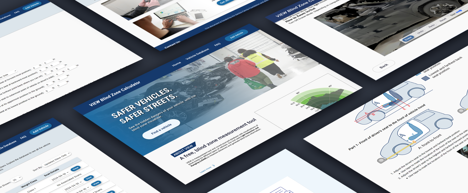
With technological advancements and new partnerships over the past 5 years, there is increased demand for a robust assessment of the VIEW methodology to improve its capabilities for accuracy, efficiency, and ease of use. We explored several measurement methods to calculate blind zones of vehicles and selected a new methodology to implement on the VIEW website. We also evaluated the user experience of several aspects of the VIEW system, including the website and measurement process, to produce a completely redesigned website and data collection experience based on several rounds of user testing.

Audit existing site

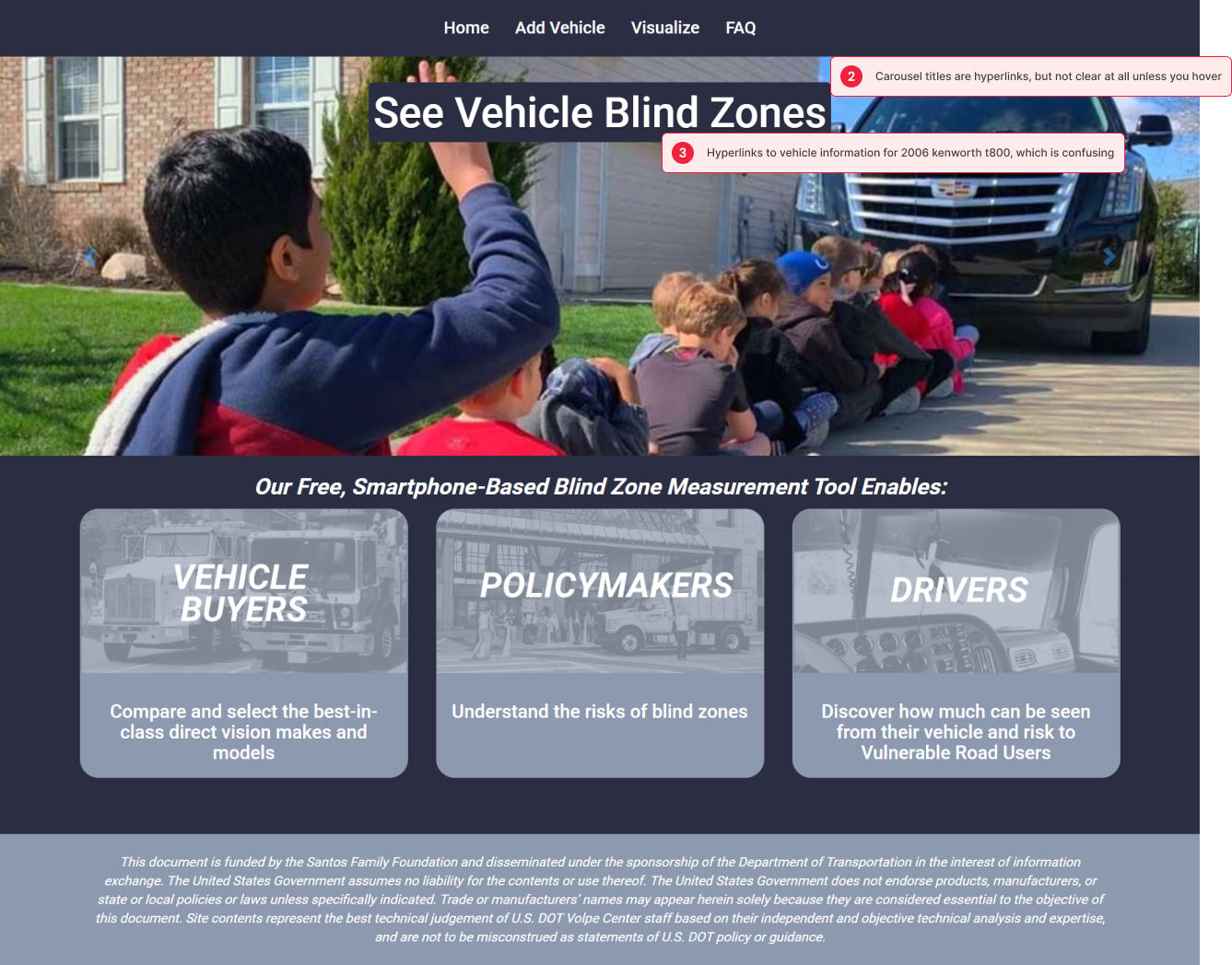
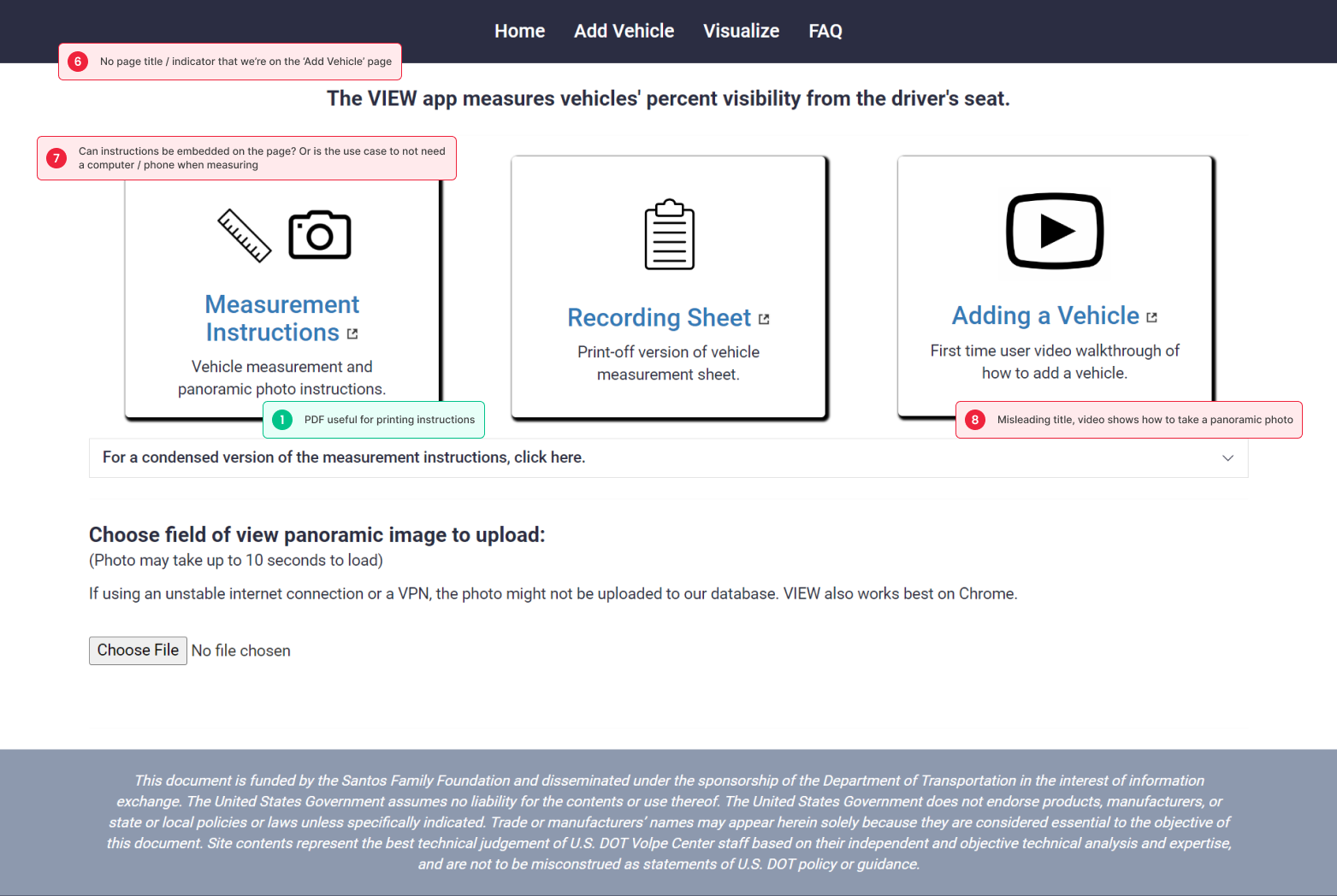
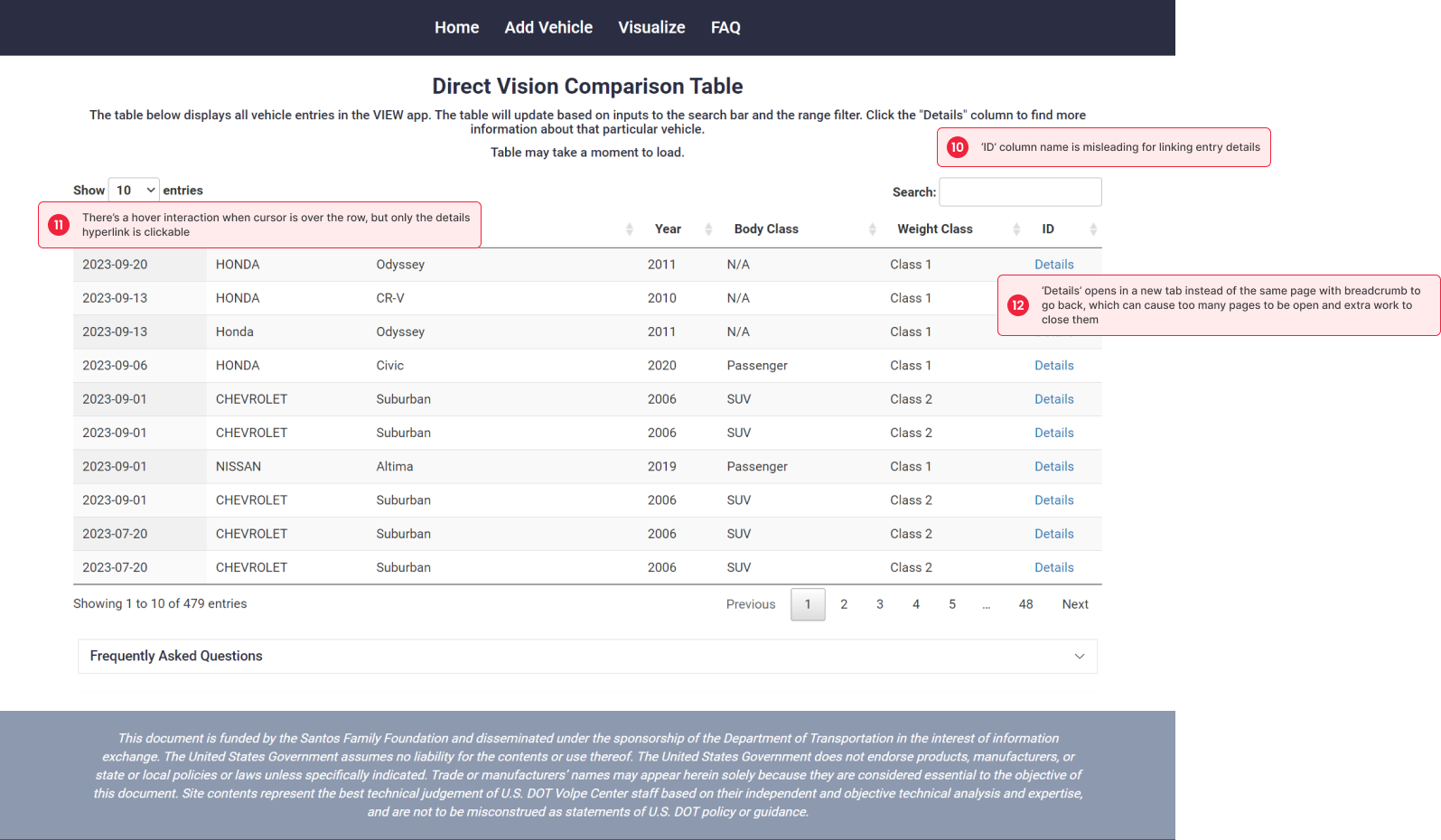
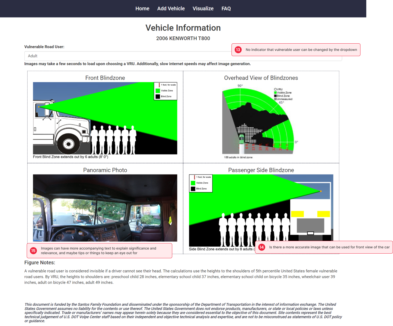
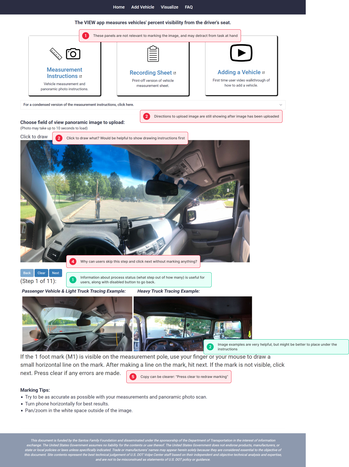
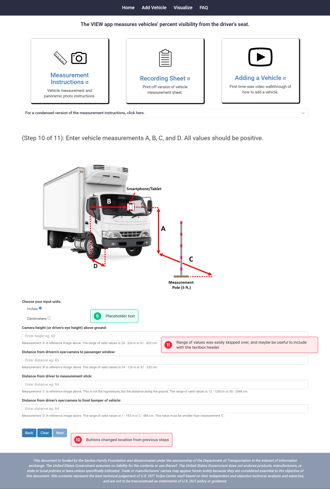
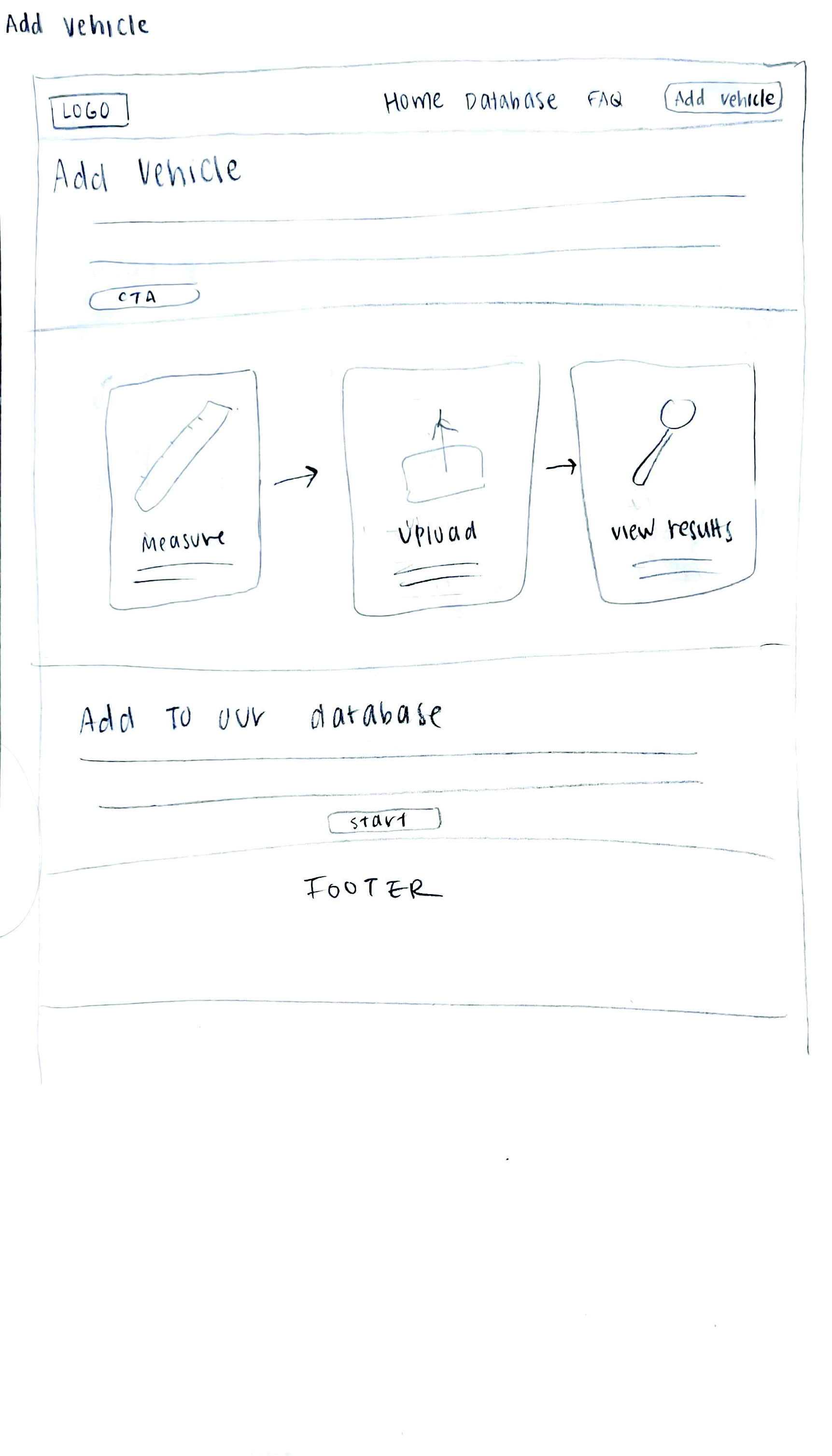
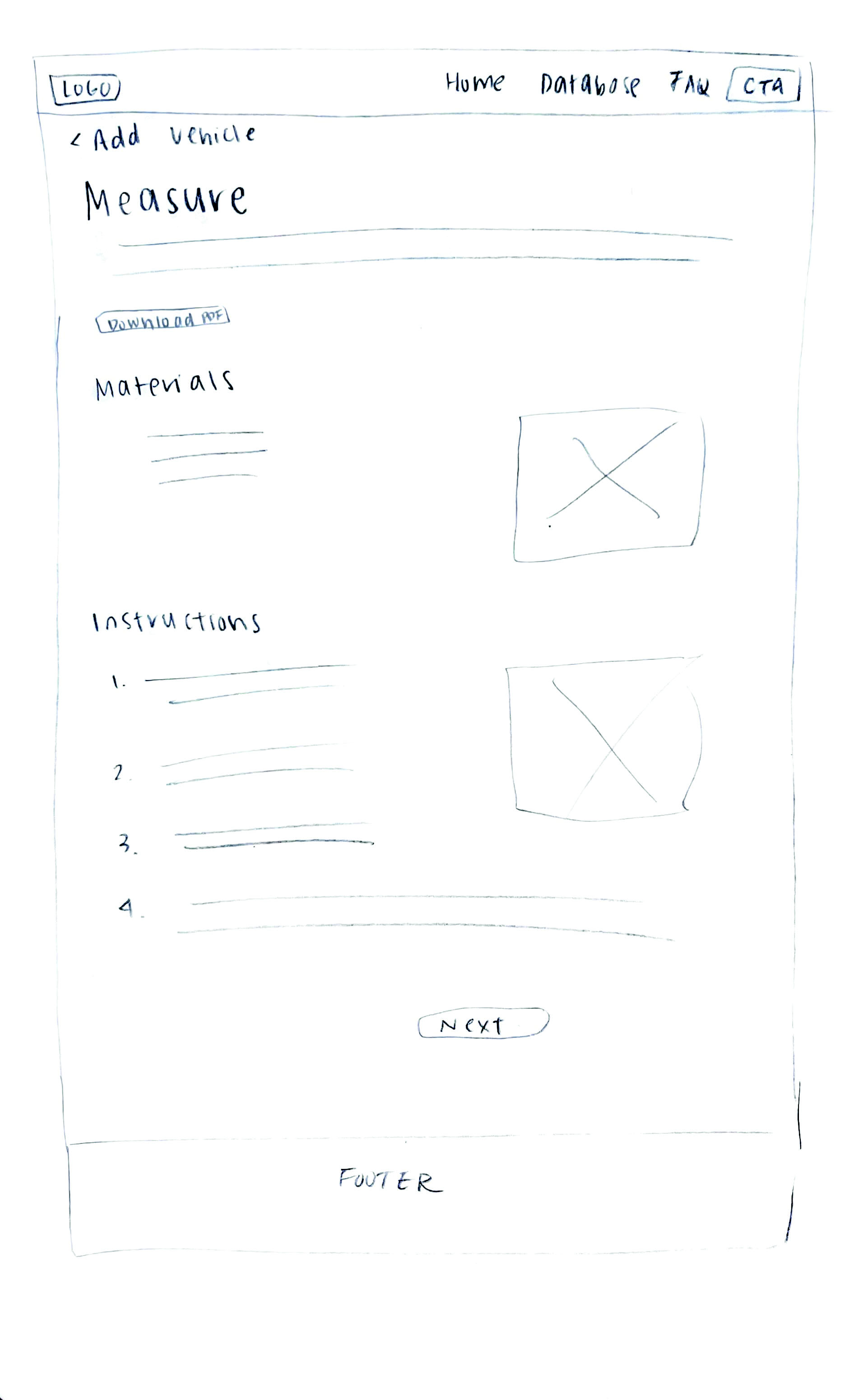
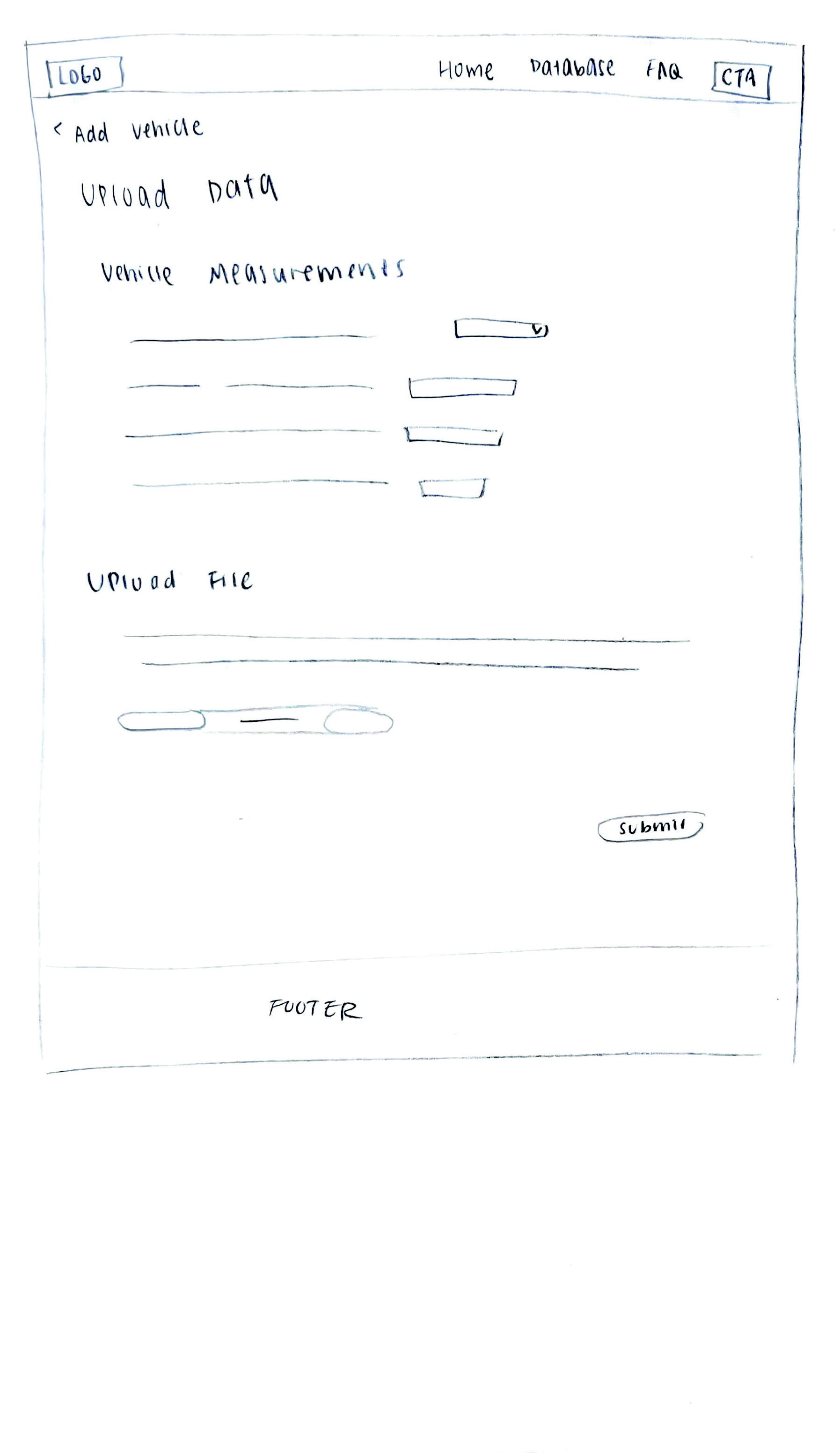
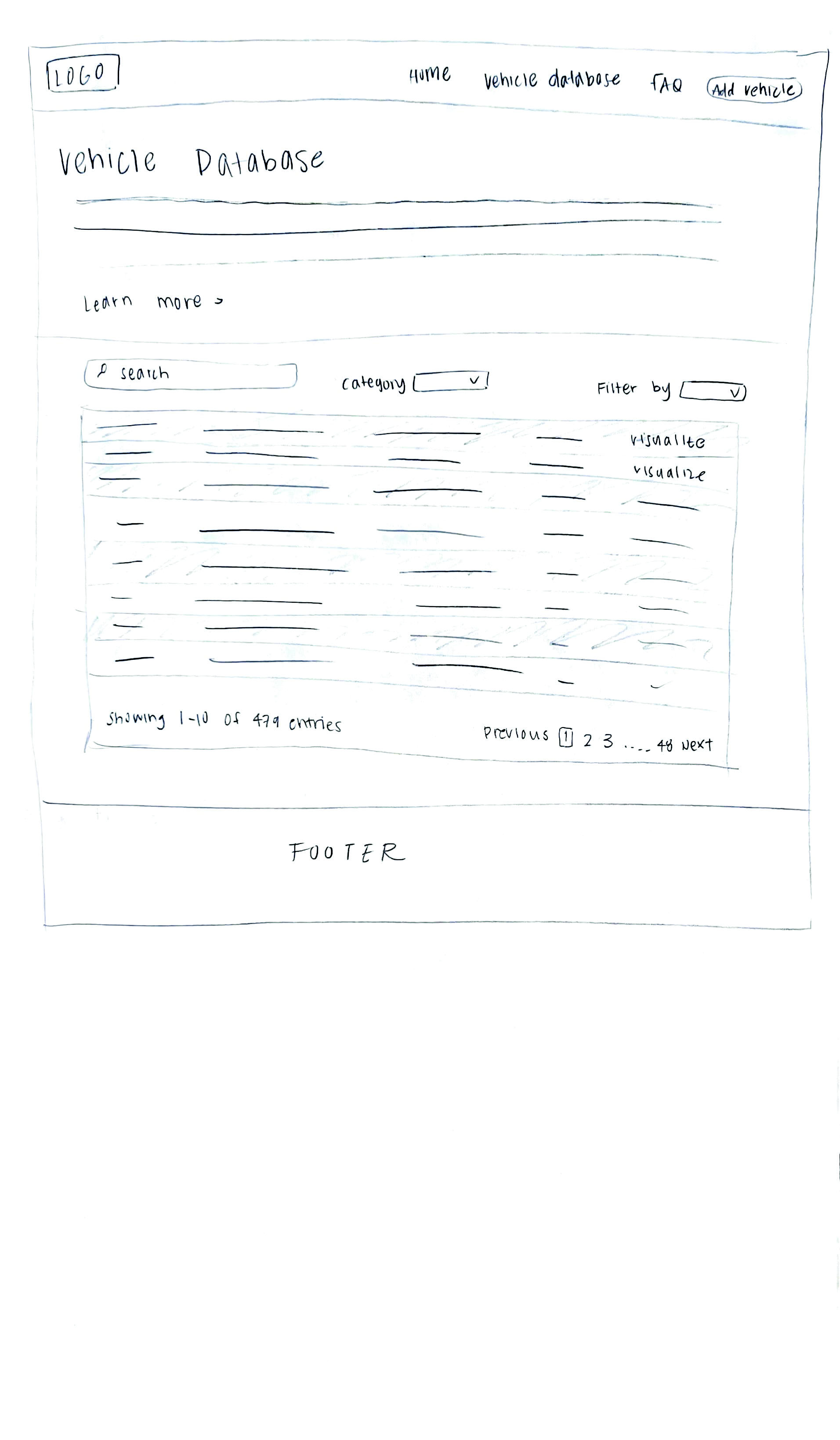
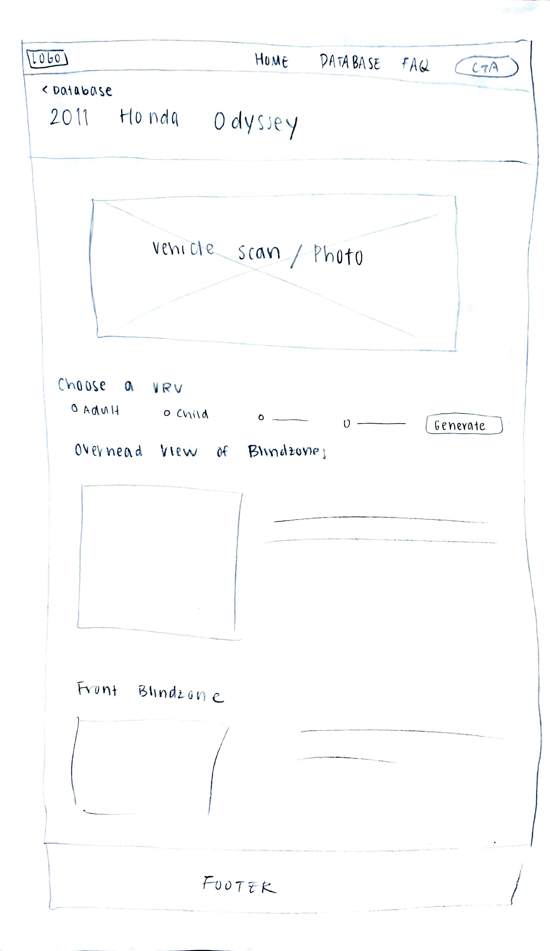
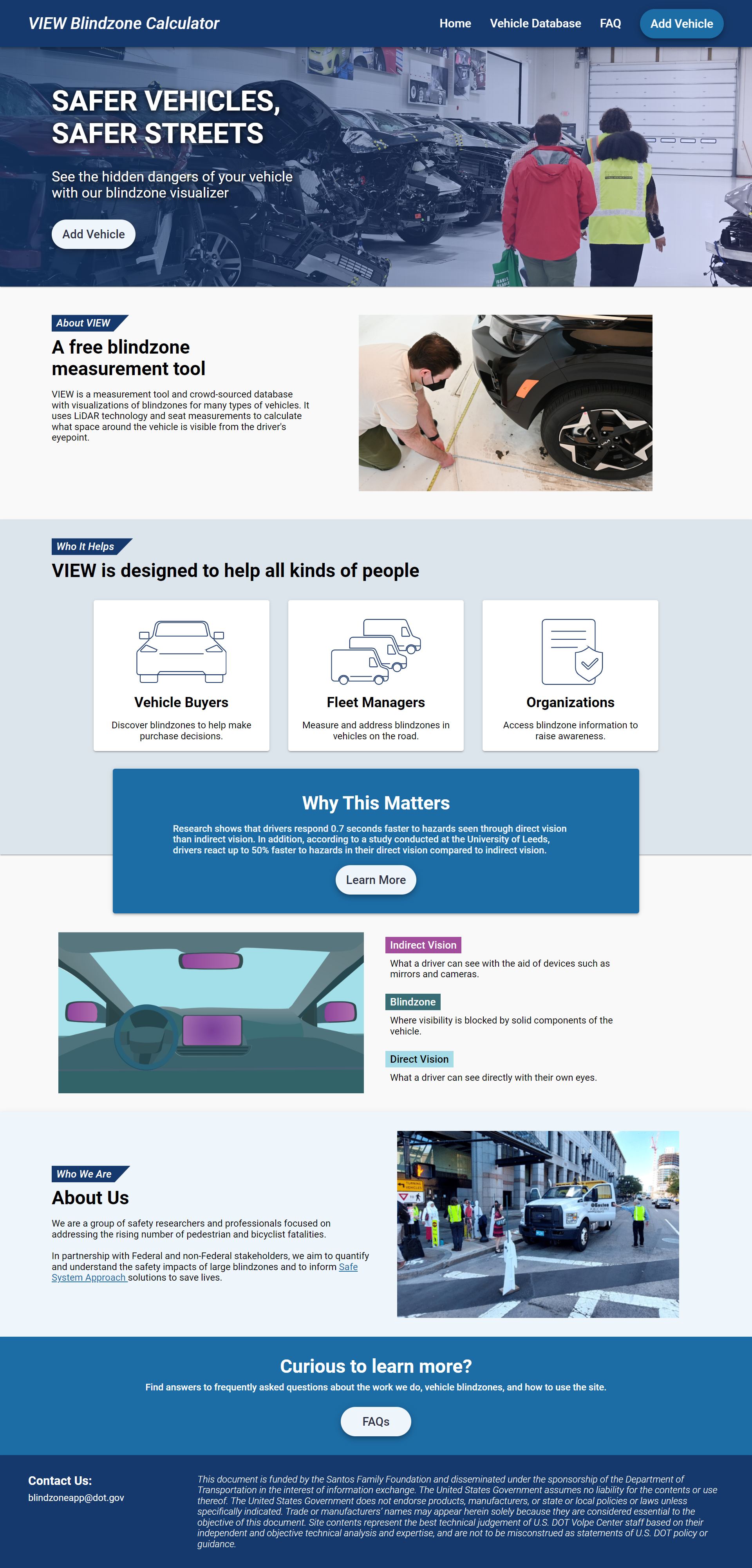
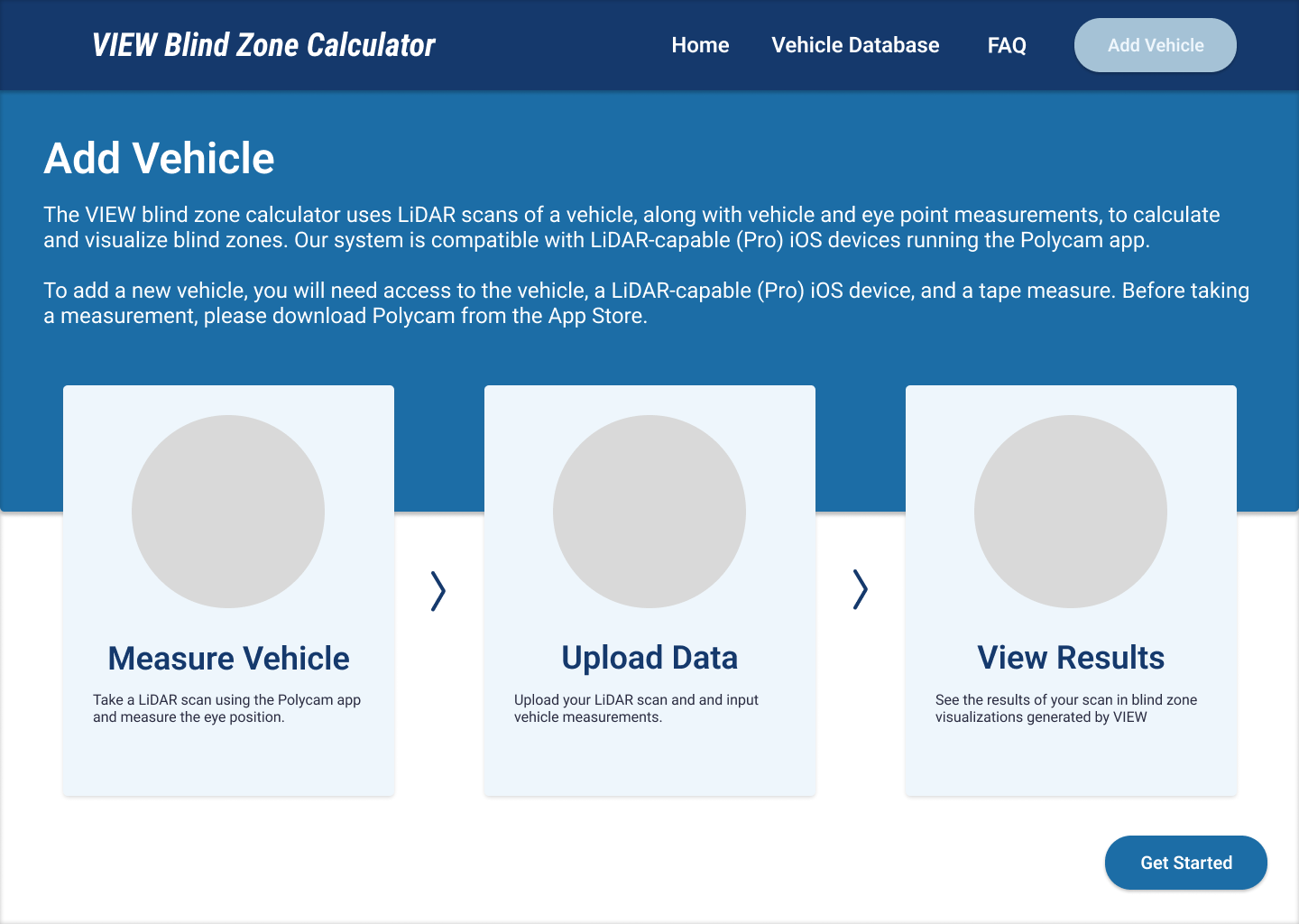
To familiarize ourselves with the current project state, my team and I went through the site, vehicle measurement process, and data upload process. I primarily focused on the website UI and UX and conducted a site audit for all the screens and flows. Using best UX practices, I identified areas that were working well and what needed to be improved. Below are examples of some of the screens I audited.

The key themes I identified across several pages were:

  • Inconsistent components across the site (header, disabled button use, visual language)
  • Hierarchy is not very clear: order of information shown on page can be better utilized to retain users and decrease confusion
  • Confusion caused by inaccurate labels in tabs and hyperlinks
  • Lack of affordances to indicate what actions users can take (hover interactions, dropdown functionality)

As a team, we uploaded test measurements to mark up and noted the following difficulties:

  • Drawing on the photo is frustrating with a laptop and a mouse
  • Instructions were confusing- unclear that we are supposed to mark 90 degrees to the right of the line until the last step
  • No indication that the visualization and table are taking time to load, leaving us confused and thinking there is an error
Define UX Strategy

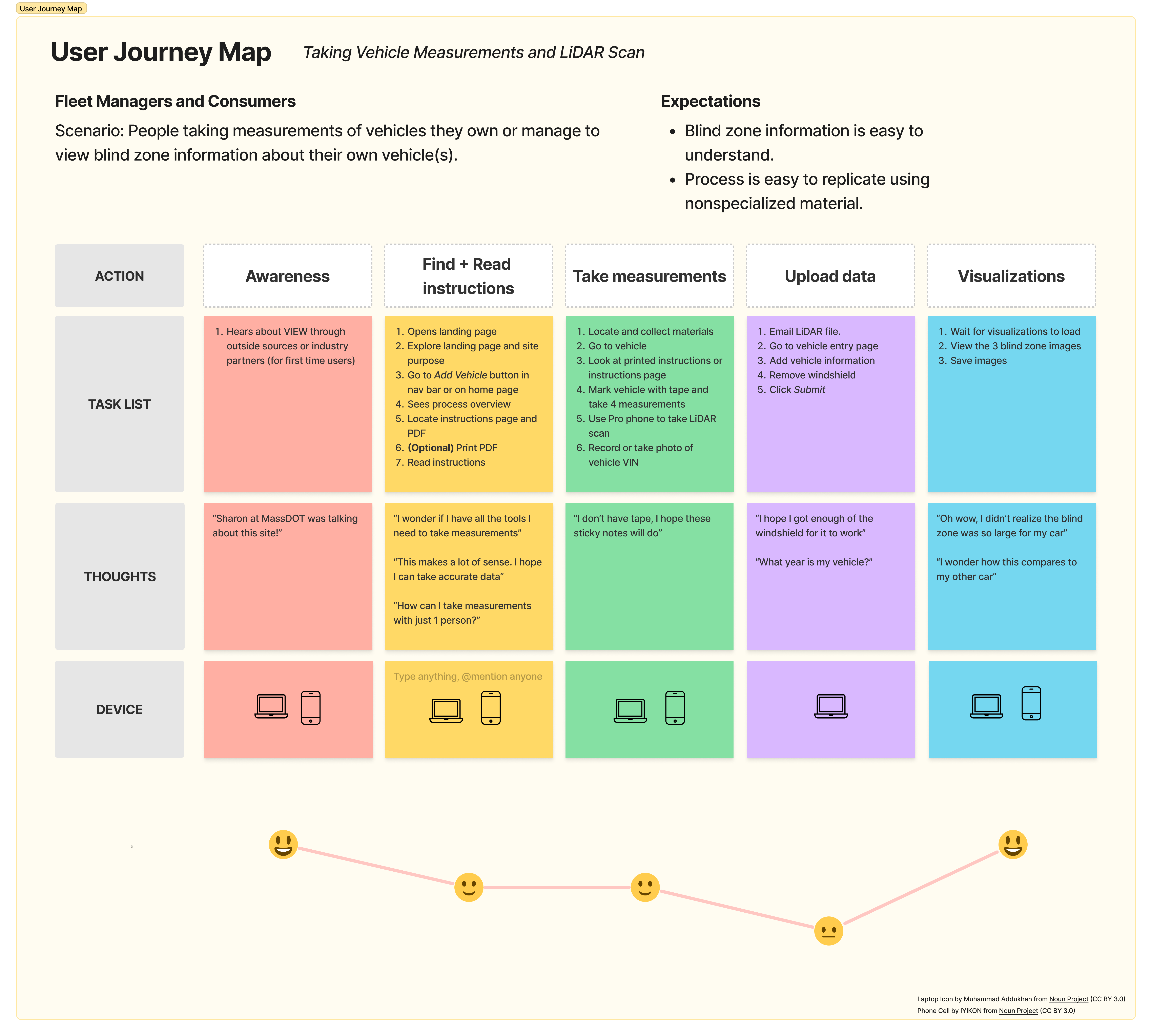
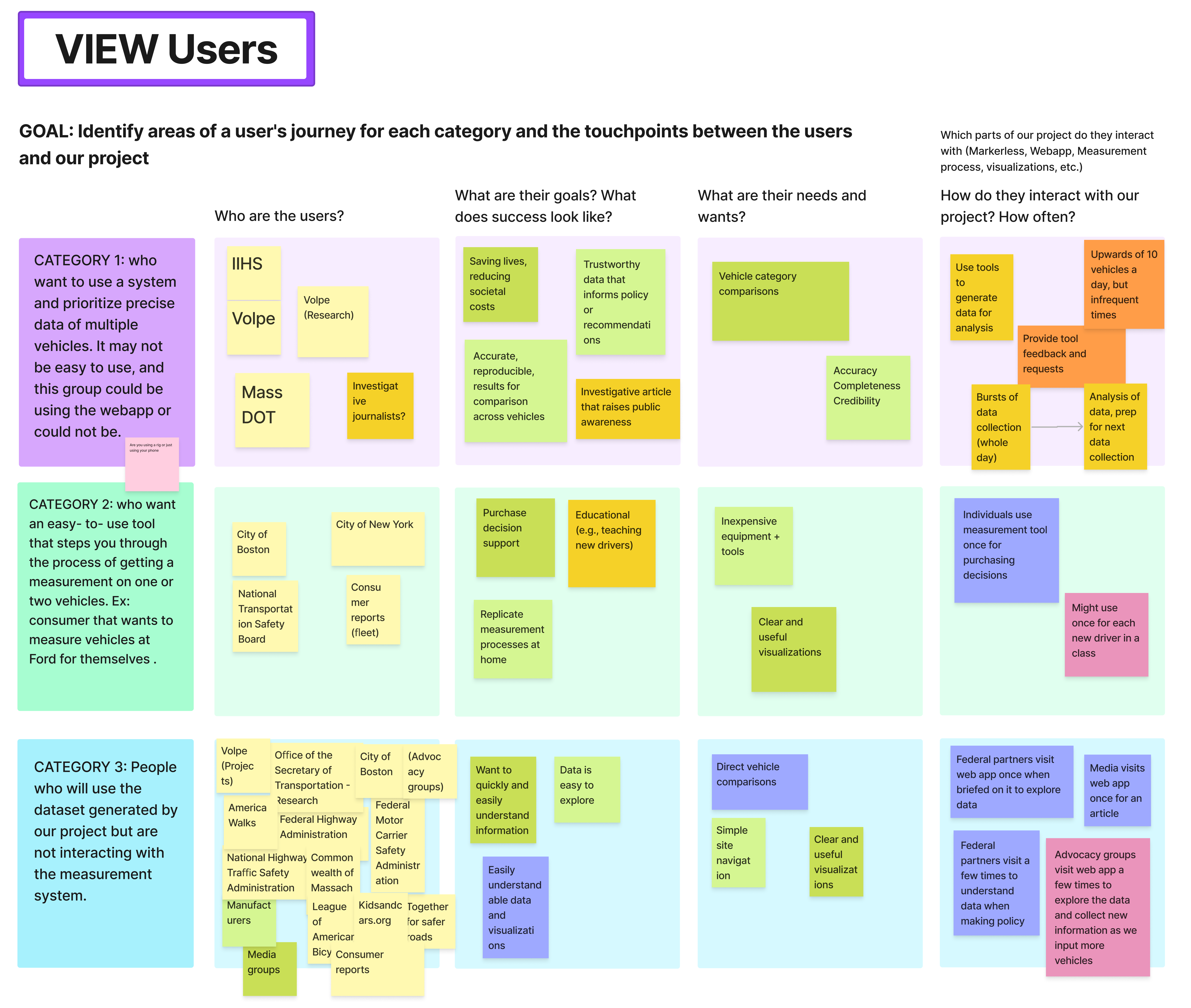
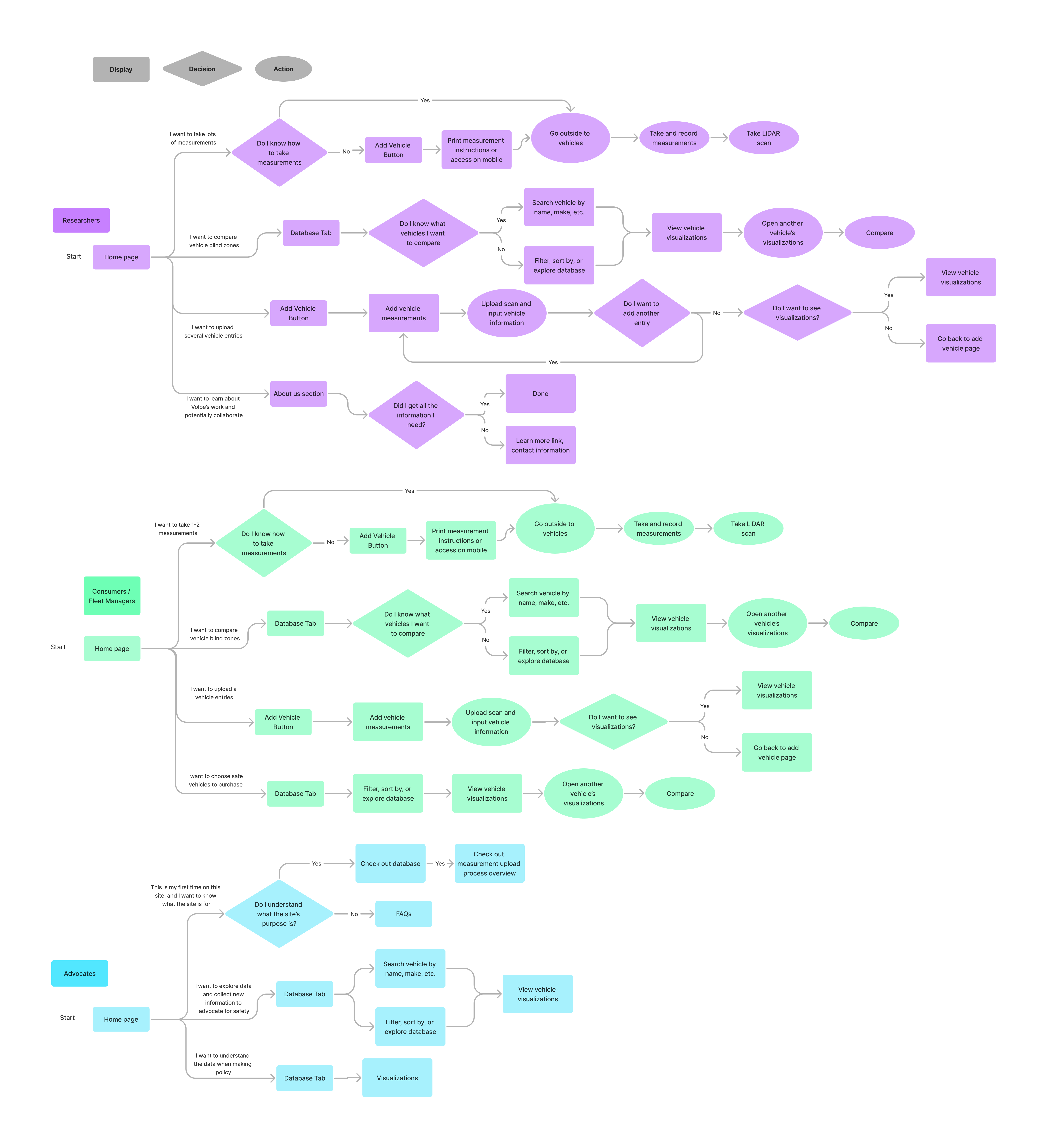
At this point, our team had become familiar with the current project state and had some ideas of the direction it could go in. However, we had some confusion on who the intended user group was, as conversations with our liasons indicated that they wanted VIEW 2.0 to have capabilities used by both professional researchers and everyday users. We needed to understand who the primary users would be in order to design a seamless experience that meets their needs. I lead a workshop with stakeholders at both Volpe and IIHS to identify our project vision and user groups.

This workshop helped us identify 3 different groups of users who would be impacted by the VIEW 2.0 ecosystem. We wanted to focus on our Category 1 (Power users) and Category 2 (Everyday users) who would be interacting with the VIEW site and measurement process, whereas our Category 3 (Data users) would primarily only be looking at the visualizations and information produced from the site but not taking vehicle measurements. The key differences between our Category 1 and 2 users are:

  • Power users: People who prioritize precise data from high-volume measurement, even if the system has a higher barrier of entry. They will be using VIEW 2.0 to access measurement instructions, upload data, and use the eraser tool to process the LiDAR scan. To support their needs, we want to design a measurement process with high accuracy blindzone calculations. Ex. Volpe, IIHS
  • Non-power users: People who want an accessible tool for low-volume measurement, such as for taking measurements of an existing fleet of vehicle(s). They may take their own vehicle measurements and scans, or they will partner with power users to measure vehicles. To support their needs, we want to prioritize a measurement process that can be done without specialized tools and with minimal effort. Ex. City of Boston, NTSB

The below swimmers lane diagram visualizes the touchpoints of each category of users with the different components of the VIEW 2.0 ecosystem. The workshop helped us create a UX plan for VIEW 2.0

Conduct User Interviews

Next, I wanted to further identify areas of improvement and problems with the current VIEW site by real users. I interviewed 7 people in 30-minute interviews and had 4 of them navigate the VIEW 1.0 site, while I asked the other 3 about their experiences taking vehicle measurements and uploading it to the VIEW site.

The key insights I identified about the VIEW site were:

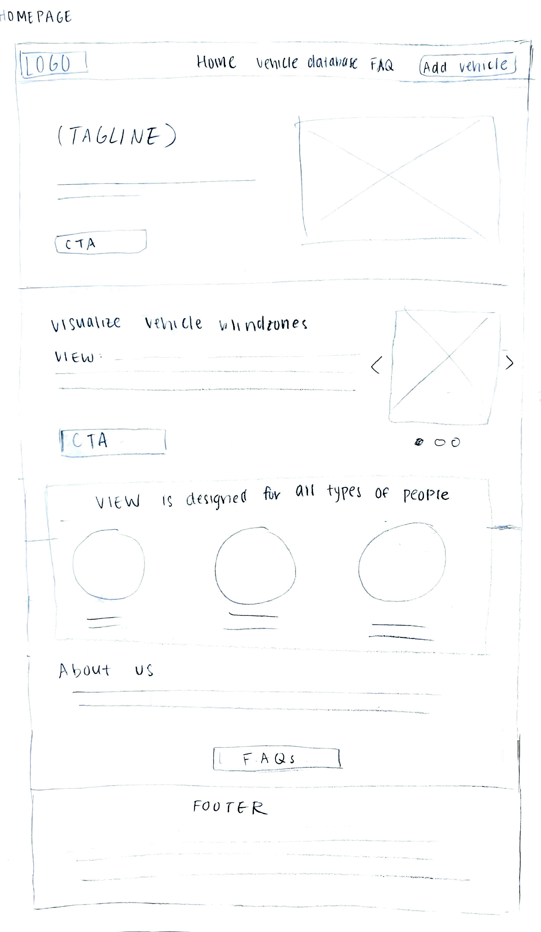
    Homepage didn't really convey site purpose and next steps:
      "I first thought this was an information site for a smartphone app until I went to FAQs"
      "My first thought when I saw the home page is a free smartphone-based tool, but where's the tool, how do I use it, I'm on a desktop website"
      "To be honest, I don't really understand what's happening"
      "I knew there was an app, but I didn't see the app anywhere"
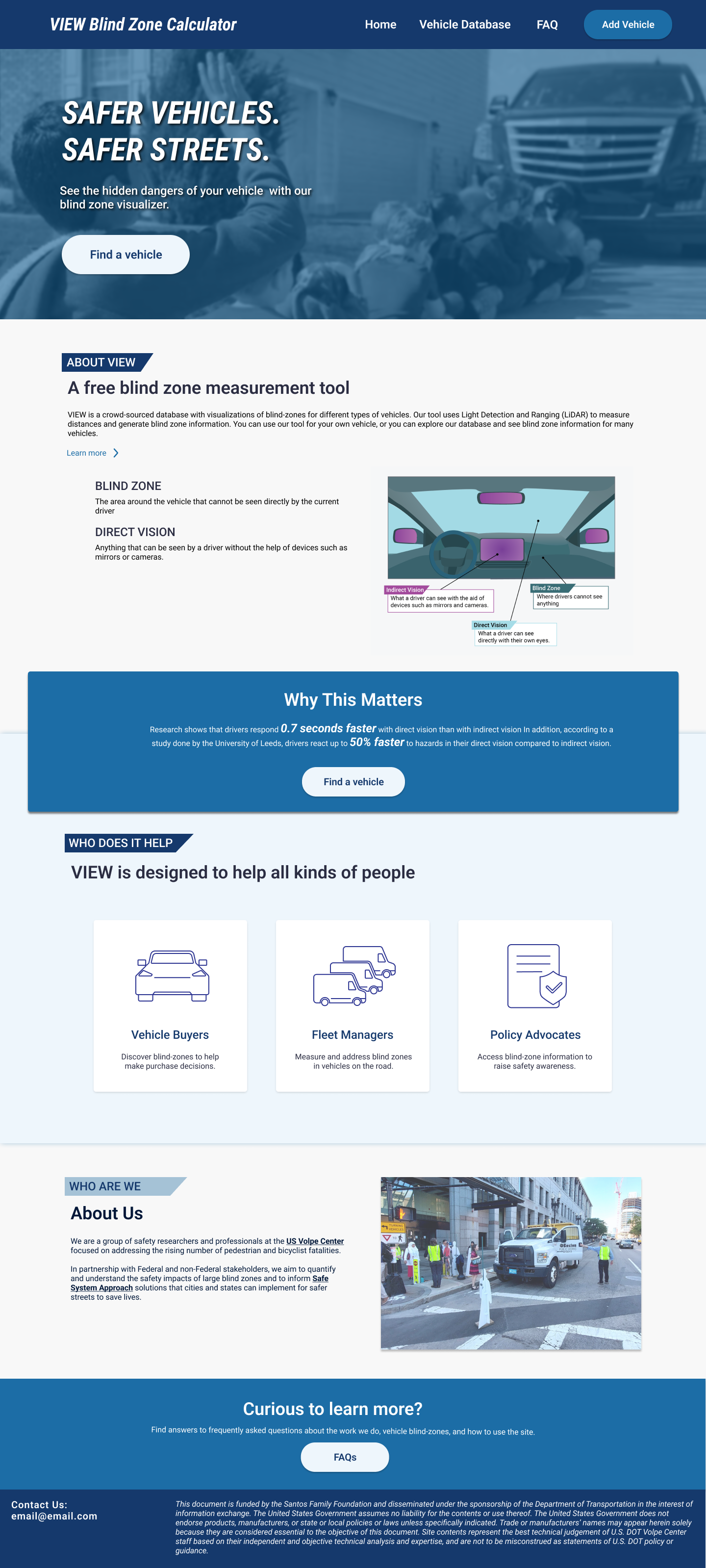
    Site seems outdated and visuals can be improved:
      “Carousel seems like it was created 10 years ago with the font and everything”
      “Overall, the site feels amateurish. It's confusing that there's an app and a table. Feels like it should be 2 separate things”
      “I would love to make this site a lot more beautiful”
      “This feel liks, oh, I feel like this was made in 2005 by the US government”
    Information about direct vision is useful and should be in a more prominent place:
      "I didn't know what a blind zone is, the word I've heard more is blindspot"
      "I didn't know those (indirect vs direct vision) were two different things"
      (In response to "What is direct vision")
        “This makes me care a lot more about what's happening now. I would love to know this fact before starting to deep dive into it”
        “There you go, that I would've liked ot know beforehand”
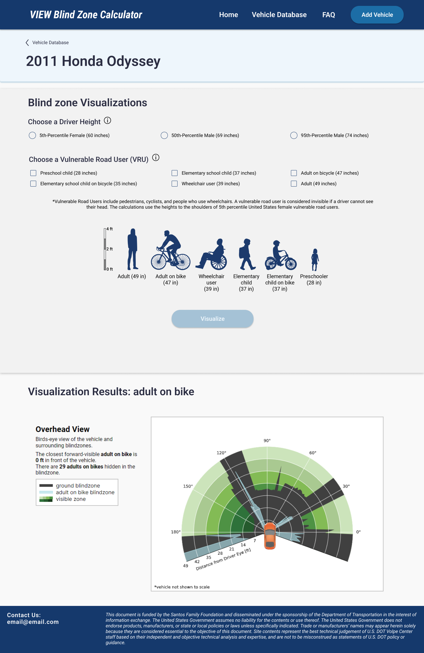
    Blind-zone visualization can be clearer:
      “Extends out by two elementary school children” is not super clear
      “I don't really understand this”
      “Oh, here are the heights, I could have used that earlier"

I created a task flow diagram and collected images to visualize the current experience of taking vehicle measurements and associated pain points.
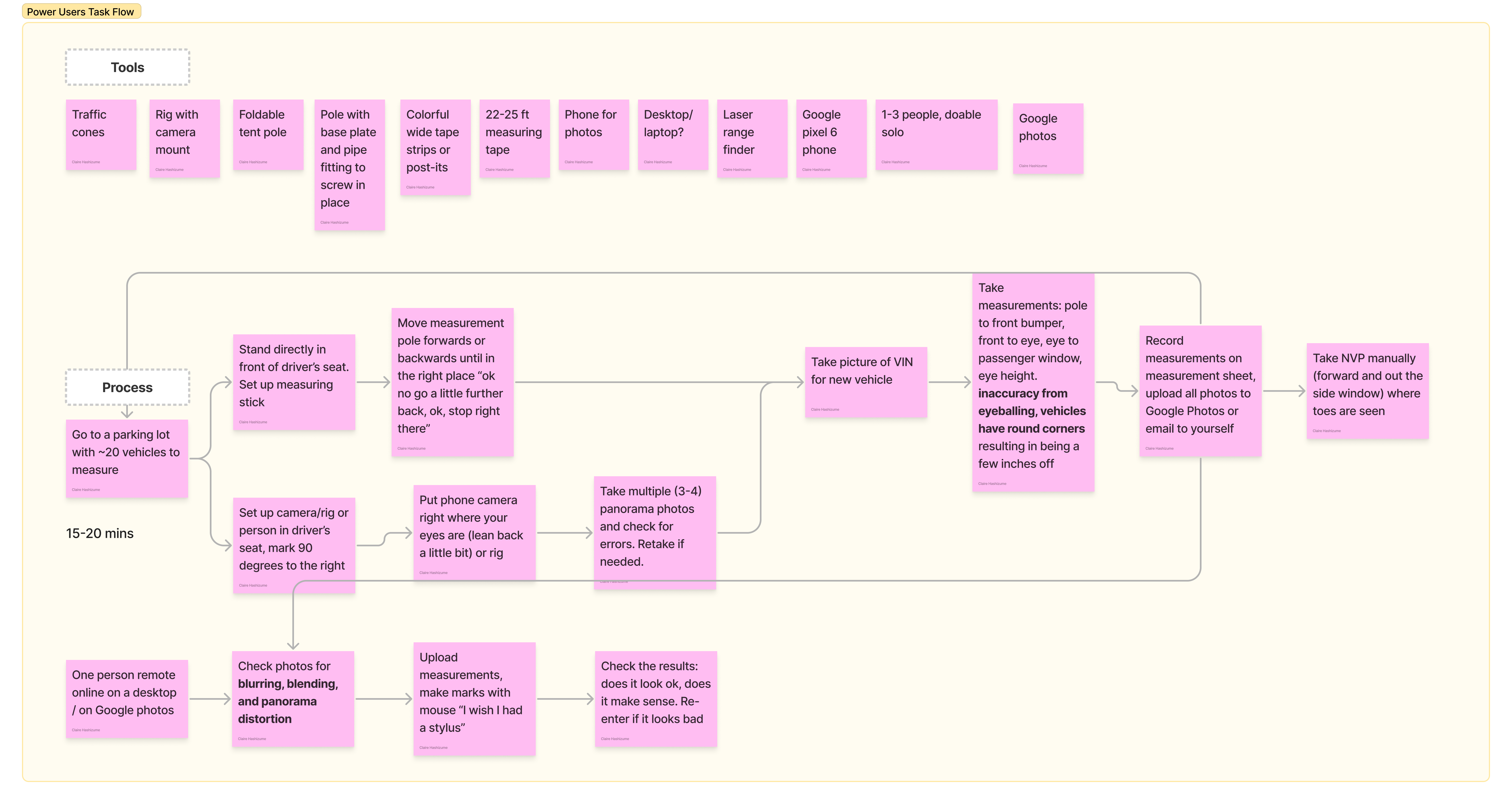
Insights from the interviews were:

    Process to mark photos is frustrating:
      "Drawing lines is subjective and takes time without a touchscreen since the mouse is clunky"
      "There is a lack of forward-backward navigation and visibility of what step users are on"
      "It is difficult to understand how to mark things: where to start and stop annotation, what surface to mark"
      "I knew there was an app, but I didn't see the app anywhere"
    It is confusing to use the site:
      “Some of these users are not engineers”, and the site should support those users”
      “Three researchers failed to use the site correctly the first time”
      “Wording is really confusing”
    Analysis is unreliable and slow:
      “Different phones produced different blind-zone results”
      “There is lots of distortion and blurring in the panorama photo, especially the passenger side”
      "Needing to use a tape measurer and a stick feels embarassing and unprofessional"

REDESIGN

Ideate Design Ideas

Taking the insights identified previously, I began sketching new website screen designs that address and better support use cases for the new site. My role on the team was to lead the redesign of the website and UI, whereas other software engineers on my team worked on developing and testing new processes to produce vehicle blindzone visualizations.

Picture of butcher paper with sticky notes of 100 ideas
Mockups and Variations

For each screen, I created mockups using Figma. I also explored variations for the home page, add vehicle tab, and the blindzone visualization page.


Home Page

The main redesign focus for the home page was to address the confusion and misunderstanding many users had regarding what the measurement tool is and the various actions they can take on the site.

In the banner and navigation bar, I added clear CTAs to 'Add Vehicle' and to 'Find a Vehicle' to clearly indicate what actions users can take from the landing page.

I removed the "Free, Smartphone-Based Blind Zone Measurement Tool" and instead included information about the technology our methodology uses, LiDAR, and that this site was a crowd-sourced database. I wanted to give enough context about what VIEW is right when users arrive to the landing page.

Next, I included some example use cases with updated visuals.

Based on direct feedback in previous interviews, I included a diagram showing indirect vision, blindzones, and direct vision. I redesigned this diagram to make it more modern and to fit the site style, and emphasized why this direct vision is so important with a CTA below.


Home Page Alternative Design

I explored alternative designs to find the best way to resolve the pain point I had identified from users. In this previous design, I had lumped together the blindzone information in the 'About VIEW' section. I ended up separating it into two different sections because I wanted to make sure users clearly understood what VIEW is by reading the text and by seeing the images in the automatic scroll that shows an example blindzone visualization and two images of taking vehicle measurements.


Add Vehicle Page

The main CTA I wanted to highlight was to encourage users to take vehicle measurements and contribute to the vehicle database. This was one of the reasons our team chose the LiDAR method for vehicle measurements, as it was more easily replicable by non-power users. The 'Add Vehicle' page provides a brief overview of the process along with two flows:

  • See instructions for data collection
  • Upload and process data


  • Add Vehicle Page Alternative Design

    The original design I explored was to have one flow for the entire 'Add Vehicle' flow. Users will find measurement instructions, take measurements, upload data, and view results all in a step-by-step process after clicking 'Get Started'. However, we quickly pivoted from this design since the measurement instructions will be used outside at the vehicle, and based on what we had learned about the previous measurement process, a laptop was not usually brought out to the vehicle. Instead, users tended to print out the instructions and write down the measurements ouside, then return to their laptop to upload the data and view visualizations.


    Measurement Instructions Page

    The instructions page includes a downloadable PDF, materials needed, and detailed instructions on how to take various seat measurements and the LiDAR scan.

    I created the diagrams showing the 6 seat measurements users needed to take, and took photographs of the measurements and LiDAR scan being taken of an actual vehicle. We had learned that visualizations of the measurements were useful in the prior method, so we wanted to update it to match the site style and include it.

    For the LiDAR scan, we added a video of us taking a full scan, along with annotated screenshots of the Polycam app that we are using to take the 3D scan.


    Upload Data Step

    On this page, users will input the vehicle information and measurements they have collected. There are two steps in the data upload process: inputting / uploading data, and then processing the LiDAR scan to remove windshields. We added the step number at the top to minimize confusion and manage expectations.


    Remove Windshield Step

    To prepare the LiDAR scan, we needed user actions to manually remove the windshield of the vehicle to identify areas of direct vision. We were hoping there was a method to automatically remove the windshields, but due to the scope of the project, that was something we could not include.

    I collaborated with the software engineer working on this tool on several UX aspects:

  • What controls would best support the user? Originally, we had no undo option which severely inhibited their ability to properly erase the windshields
  • How to best convey the controls for clear comprehension?
  • Ensure this window matches the rest of the site style

  • Vehicle Database

    This table shows all the vehicle entries on the VIEW site. I wanted to ensure that there were just the right amount of search, filter, and sort by options to support users in quickly and easily finding the vehicle they are looking for. The previous site had around 480 vehicle entries, so we wanted to prepare the design for similar functionality and support.

    I had learned during prior interviews that the old column names led to confusion, so one specific change I made was to use a 'View' button for the ingress to the vehicle visualizations. I also wanted to allow the option to open the visualization in a new tab to make it easy to compare vehicles, which was an important use case we had identified.


    Vehicle Visualizations

    This page exists for each vehicle entry in the database that had successful processing. First, we take user input on driver height and what VRU's they would like to see blindzone visualizations for. We provide a to-scale diagram showing various VRU's and also have tooltips that provide additional information about Driver Height and VRU's.

    Once they select all fields, the 'Visualize' button becomes active and the visualization is produced below. We provide key numbers in terms of how many VRU's are hidden in the blindzone and how far the nearest visible VRU stands. The diagram is color coded with a legend that shows the blindzones and visible areas. We specifically chose to emphasize the number of VRU's hidden in bold because we learned that it was impactful to users in further understanding how important direct vision is.


    Vehicle Visualization Alternative Design

    This alternative design has three main differences. First, we include an image of the vehicle from the LiDAR scan. Next, we do not have options for different driver heights. Lastly, we show different visualizations by using dots in the overhead view and adding a side and front view.

    The vehicle image was not included in our final design due to technical limitations and privacy concerns if the licence plate were to be visible. With more time, we would have liked to find a way to include the vehicle image on the page so that users have an additional way to confirm they are viewing the intended vehicle.

    We added additional driver height options because that was a strength of our new LiDAR method. With one vehicle scan and knowing the seat bounds, we were able to select any driver eye height to view blindzones for. We had considered having a custom input field to type in a specific height, but we decided that a similar impact in a simpler way would be achieved by adding 3 standardized eye heights.

    The previous VIEW visualizations contained the front and side views. I created mockups for how it would look with a more modern diagram and more accurate VRU's, but due to technical and time limitations, we were unable to include it. We instead included bolded text that shows how close the nearest visible VRU is.


    Conduct User Tests

    To ensure that I was successful in confirming prior hypotheses about user frustrations, I conducted a second round of user testing on the redesigned screens and variations. I created an unmoderated test with 6 participants using Lyssna and interviewed 1 power user. The full user testing report for this project including both rounds of user testing, scripts, raw notes, and participant profiles can be found below.

    VIEW 2.0 User Testing Report

    Overall, the unmoderated user testing showed that the redesigned screens were successful in addressing the pain points with the previous site.

  • 5 out of 6 participants correctly answered questions about the site purpose, actions users can take, and what each navigation tab leads to.
  • One participant still had confusion on how the tool works and thought it required ordering and installing.
  • For the blindzone visualizations, two participants had trouble using the prototype, and 3 participants ranked their understanding high at a 4 or 5.
  • When asked the magic wand question about any changes they would like to see, 4 out of 6 participants said there is no need to make changes, and 2 participants suggested minor changes in consistent coloring and image descriptions.
  • One participant suggested there needs to be more support for bigger work vehicles for fleet managers.
  • User Task Flows

    I created new user journey flows of the vehicle measurement process for power users and non-power users. Due to project constraints, we were unable to test the new measurement process with users, but we based the new process on the frustrations and opportunities the prior method presented.

    New User Journey Maps for Vehicle Measurements

    I created new user journey flows of the vehicle measurement process for power users and non-power users. Due to project constraints, we were unable to test the new measurement process with users, but we based the new process on the frustrations and opportunities the prior method presented.

    Ship Website

    Prepare Designs for Development

    Once the designs have been finalized, I worked with software engineers to ship the website. We translated the front-end designs to HTML/CSS, and the software engineers integrated the backend, hosting platform, and database. We collaborated on ensuring there was a cohesive visual design among all aspects of the site.

    While the site was being devloped, I tested the site functionality to ensure that everything worked as intended. We did a QA of all pages and flows, tested all site links and form fields, and confirmed that the blindzone visualizations were accurate.

    Our final site is live at https://blindzonesafety.org/. Check it out to learn about the importance of direct vision and take measurements of your vehicle to see its blindzones!

    Final Report

    Our team wrote a final report with the year-long work we did on the project. The report is intended for our partners at the Volpe National Transportation Systems Center and future SCOPE teams to continue working on VIEW 2.0 after handoff.


    Final poster and Impact

    We presented our project at two presentations: one with over 80 attendees in-person and remote at the Volpe Center, and the second at Olin's SCOPE Summit with all the capstone teams. We shared our work throughout the year, and the final site, wrapping up in a Q&A session. Below is our presentation deck, which I took the lead on the visual design and communication of.


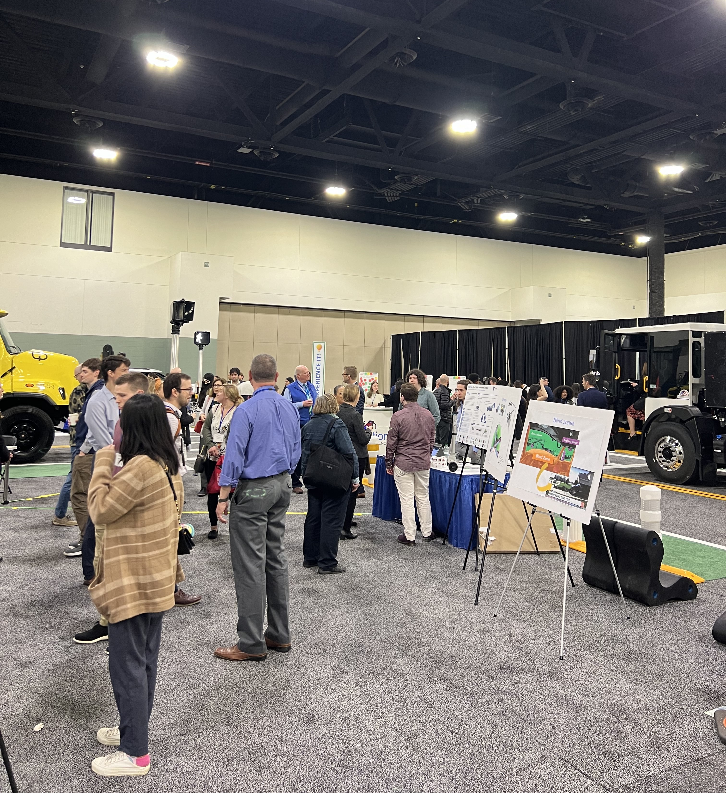
    In addition, we had the opportunity to participate in the 2024 MassDOT Transportation Innovation Conference and share our project. Participants were able to experience the significant difference of a vehicle with high visibility vs low visibility.


    The immediate impacts of VIEW 2.0:
  • Increasing accuracy and robustness of the measurement method to visualize blindzones by over 85%
  • Redesigning the user experience of the website and data collection to be intuitive and easily replicable
  • Increasing long-term site stability by integrating
  • Broader impacts:
  • Raising awareness on vehicle blindzone safety by building out the database with more vehicle entries
  • Shift consumer preferences and automakers towards high visibility vehicle design
  • Potential to inform vehicle visibility policy
  • VIEW 2.0 Final Informational Poster


    © clairehashizume.com. All Rights Reserved. Designed by HTML Codex